Tia Jasmin DesignTia Jasmin DesignTia Jasmin DesignTia Jasmin Design
  • Home
  • Personal Work
  • Illustration
  • About Me
  • Home
  • Personal Work
  • Illustration
  • About Me

The BAM Group Real Estate

  • Posted By Tia Jasmin
  • on May 9,2022

THE BAM GROUP REAL ESTATE TEAM MARKETING

The BAM Group is a real estate team located in Winnipeg, Manitoba. I work with them on a contract basis to develop and manage marketing initiatives, ensure consistent branding, and create a steady stream of quality content for social channels.


I manage The BAM Group’s instagram and social media channels, creating and designing consistent content. I develop blog posts, testimonials, infographics, and trend images for the feed, as well as posting about any new home listings. 

I also create their listing packages for potential clients, with information on their process and track record laid out in a professionally designed, 40 page print out.

For certain homes, I also create editorial style feature sheets to promote the key selling points to potential buyers.

When a sale closes, we also welcome the buyer to their new home with a package to guide them through being a new homeowner. This includes tips about the neighbourhood, upkeep info, and how to maintain a home’s value over time.

The team hosts a summer party and a holiday party every year, which allows for a bit more freedom when it comes to signage and branding around each event.

We also produce a number of swag items such as custom notepads, stickers, and tote bags.


Ideal Pour

  • Posted By Tia Jasmin
  • on July 26,2021

Ideal Inventory / Ideal Pour Logo Design & Branding

Ideal Inventory and Ideal Pour are related software products that help bar managers properly track and manage their inventory. I was brought on to create logos for both products as well as an overarching brand that would bring the two together and attract new clients.

The logos for IdealPour and Ideal Inventory are intended to work together as one branded system, while also be able to stand on their own. The intention here is to create a sophisticated, upscale look while incorporating colours and layouts that give a modern, tech forward feel.

The brand is comprised of bright, high contrast colours as well as patterns such as custom halftones and waved lines. These elements work together to create a cohesive look.

The “II” and “IP” elements can be used as monograms or as a frame for text, photography, or other content.

The brand should use dark, moody photography reminiscent of being in a high class lounge or bar to set the scene and immediately speak to Ideal’s specialty. 

In the end, I created a slide deck, letterheads, business cards, brochures and web page designs as part of the overall brand deliverables.


Manitoba Disaster Management Conference

  • Posted By Tia Jasmin
  • on January 7,2021

MANITOBA DISASTER MANAGEMENT CONFERENCE BRAND & WEBSITE

The Manitoba Disaster Management Conference is one of Canada’s largest disaster management industry events. After running its 29th conference, the board decided it was time to redesign its brand and website. I was brought on to complete an entire rebrand, website overhaul, and continued to provide design services in the years that followed.

For the MDMC brand, I wanted to develop a type of signature border that could be used to frame information and photos. By using this frame in different applications, you can easily reference the brand without needing the logo to appear on every application, and highlight content important to the conference such as speaker profiles or dates and times.

The main reason for the website redesign was to improve usability, organize the information, and give the site a modern, updated feel that was consistent with their new brand. 

I took all the information that already existed on their site, and started from scratch with a full redesign.

For the conference itself, we develop a printed and digital brochure each year with information on the agenda, seminars and speakers. 


Napier Emergency Consulting

  • Posted By Tia Jasmin
  • on October 29,2020

NAPIER EMERGENCY CONSULTING

Shelley Napier is an experienced and trusted emergency management consultant, and she runs a team of experts through her business, Napier Emergency Consulting. I started working with her several years ago now, and slowly built up a brand presence with a website, print work, and digital marketing materials.

I designed and developed napierconsulting.com to promote Shelley’s team and full breadth of services.

Shelley and her partner provided me with the written content and some photos from the field, and I worked to supplement that with design elements and stock photography.

I also on occasion have developed social media graphics relevant to her industry to help communicate with potential clients.

We brought the marketing materials to print as well, with various brochures targeted at different types of clients.

A big part of Shelley’s promotional strategy is to be present at industry trade shows, where materials like these banner stands have been designed, printed, and displayed by her booth.

Along with the banners and brochures, professionally branded folders were also needed to complete her trade show kit.

These folders are also used in her training sessions, where the certificates below are given out to successful trainees.


Winnipeg Jets 19/20 Season Marketing

  • Posted By Tia Jasmin
  • on January 10,2020

WINNIPEG JETS 19/20 CREATIVE

I worked at True North Sports + Entertainment, the company that owns the NHL team Winnipeg Jets, for over a year. In that time, I worked with the Creative Director and Creative Lead – Hockey to produce a range of digital and print marketing graphics for the team. 


TICKET SALES CAMPAIGNS

Our ticketing sales team is always coming up with new promotions, sales and giveaways to encourage sales. For every campaign you see represented here, I would have also created extensive social posts, eblasts, bowl digital signage, web advertisements and print collateral.


COLLECTIBLE GAMEDAY POSTERS

For every home game, we produce a custom poster often featuring a specific player for fans to take home. We are often given a lot of creative control to create whatever we want with these, so I tried to experiment with the brand and push the elements in different directions. 

We would always be sure to match the jersey colour in the poster to the one the team would be wearing on the ice, such as the Aviator Jersey featured above on Captain Wheeler.

For some games, the team would wear special warm-up jerseys such as the LGBTQ ones above or the Hockey Fights Cancer ones below, which would then be auctioned off for charity. 

For some games, the team would wear special warm-up jerseys such as the LGBTQ ones above or the Stand Up to Cancer ones below, which would then be auctioned off for charity. 


Manitoba Moose 19/20 Season Marketing

  • Posted By Tia Jasmin
  • on January 10,2020

MANITOBA MOOSE 19/20 CREATIVE

Manitoba Moose is the AHL team owned by the company behind Winnipeg Jets.  During my time as a graphic designer at True North Sports + Entertainment, my work focused heavily on the marketing needs for the team. Working within the brand, I developed creative for several campaigns, promo events and templates, and adapted my designs for web, print, and in-game digital signage. 

TICKET CAMPAIGN
MINI PACK CAMPAIGN
PROMO GAMES
SOCIAL TEMPLATES

2020/21 SEASON TICKET CAMPAIGN

Each year, during the second half of the hockey season, the Manitoba Moose releases tickets for the upcoming season, along with special offers and benefits for current season seat holders and early bird customers. It’s one of the largest marketing campaigns of the year; we advertise online, in print, and in-game in order to reach the largest and most diverse customer base possible in Winnipeg.

My approach for this creative was to pull all the disparate elements together to create a layout that balances the player, the fans and the text in a visually interesting way that still leaves room for extra body copy without creating a crowded effect. I treated the fan images as a secondary element, to show that the team is the main draw, but the atmosphere and excitement on game day is another major reason to attend. 


MINI PACK CAMPAIGN

At the start of the 19/20 season, we created a Mini Pack campaign to encourage fans to buy tickets in bulk. This also came along in conjunction with our 20th season celebrations, so we decided to lean on this anniversary heavily in the campaign marketing graphics.

I reskinned our website, created static and motion social media posts, and developed a full digital signage package for the bowl to promote this offer.

Each mini pack is carefully chosen to reflect different themes; Weekender featured mostly games on the weekend, Canadiana had us face off against Canadian teams, and Overtime featured the most statistically even matchups . I created social videos to promote each of these packs as distinct from one another to help get the customer excited about their selection. 


SPECIAL PROMO GAMES

The marketing team behind the Manitoba Moose produces a number of promo events throughout the year to encourage ticket sales and sell merchandise. Each of these promotions requires its own creative that is distinct from the regular season look while still representing the team’s branding. For each game, a long asset list is required, from social graphics and digital signage to traditional print ads and billboards, meaning the design needs to be not only engaging and eye catching but also very versatile. 

Above, you’ll see the base creative I developed for the Halloween Game, The Country Music Day, and the 20 Seasons Hat Giveaway, here used as instagram stories. The idea was to give each event its own creative look, employing illustration, texture and imagery that wouldn’t regularly be used. The Hat Giveaway graphics are the most closely associated with our general branding, tweaked just slightly to fit the theme.

The images below show how each event creative translated to the arena bowl on game day, helping to set the atmosphere and further promote the themes.

One of the more popular initiatives in the 19/20 season was the annual Super Hero Day. With an invitation to dress up in costume and a free trip for four on the line, our Super Hero theme resulted in an almost sold out game, a big win for the AHL team.
For the creative, I chose three of our popular players and developed comic illustrations of them, and incorporated textures such as parchment and halftones to push the visual theme. I also developed an animation inspired by motion comics to promote the event on social media. 


REUSABLE SOCIAL MEDIA GIFS & VIDEO TEMPLATES

The social media and game production teams behind the Moose often need to produce sophisticated graphics on the spot, reacting to lineup and score changes. So, at the start of the season, I developed an extensive library of templates and shareable GIFs for them to use. This way, they’re able to deliver the constant updates necessary while maintaining a consistent brand standard. 


ManyFest 2019 Marketing & On Site Signage

  • Posted By Tia Jasmin
  • on September 10,2019

MANYFEST 2019 CREATIVE

ManyFest is a popular festival held each September downtown Winnipeg. The colours and typefaces were carried over from last year, but a good deal of redesigning was necessary to fulfill ManyFest’s needs in 2019 as it expanded to include new events and more real estate. 

The first task was to develop a new website. I worked with a web developer to create the current updated site, with new photography and improved usability. 

One of the big challenges of marketing this festival is the myriad of events and attractions that are involved. One of the ways I decided to tackle this was to develop illustrations to represent the different attractions, such as food trucks, carnival rides, live performances and beer and wine gardens. In addition to the website, billboards, social graphics, motion graphics, and a fold-out printed guide, I also created the way-finding signage to be used at the event.

I also created a short animation to be used on social media and at the event on screens between scheduled events. 


Flatlander’s Beer Fest 2019

  • Posted By Tia Jasmin
  • on June 10,2019

Flatlander’s Beer Fest 2019
PRINT | SOCIAL MEDIA  

Flatlander’s Beer Fest is an annual beer tasting festival held in Winnipeg in support of the True North Youth Foundation. I rebranded the festival for the 2019 season, creating illustrations and choosing typefaces and colours to create a look inspired by craft beer artwork.

There was an extensive list of assets required for this, beginning with a city-wide marketing campaign leveraging social media heavily. The decision was made early on to go with a more illustrative style, but the difficult task was developing images that would be able to quickly convey the spirit of the event and be able to be adapted to many different layouts and applications. The wheat stalks and the open fields went with the name (and the location of the event in Manitoba), and the styrenes were meant to appeal to the true beer aficionados. The cheers in the foreground makes it clear that this is a fun, social event that would bring people together over good beer. 

I created the short animation below for social media, television, and online ads. 

A large part of the project was the program, which needed to feature 100+ breweries and their beer lists with tasting tips, along with our sponsors’ advertisements and information about the foundation the event supported. 

For the event itself, tickets, print signage, and digital graphics were needed to brand the event effectively. 


The Lemons – Waiting For A Train Album Package

  • Posted By Tia Jasmin
  • on May 3,2019

The Lemons Waiting For a Train Album Artwork

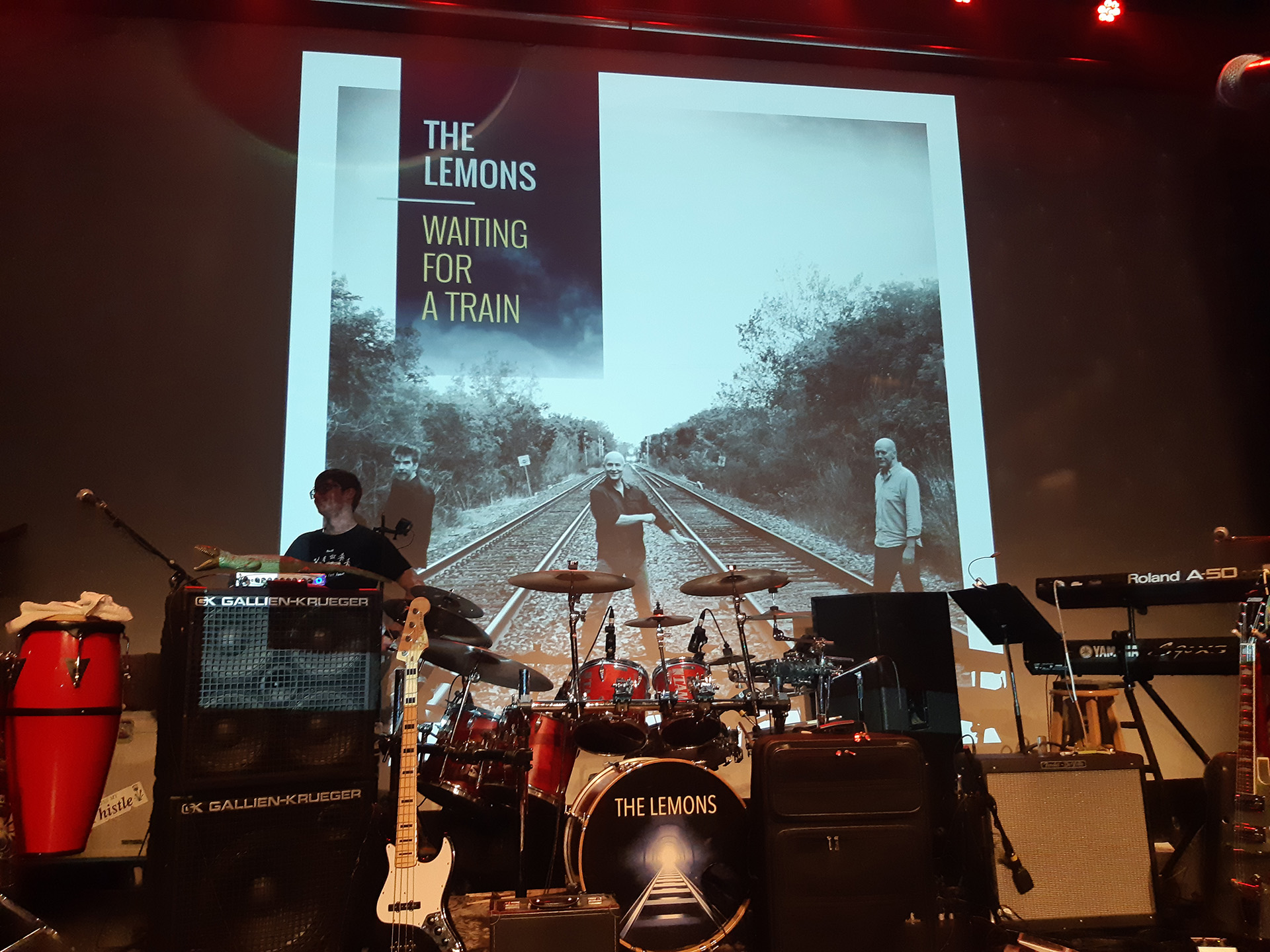
The Lemons released their second album in the spring of 2019 and needed artwork that fit their musical style and personality. Drawing from a rich 20+ year band history and the album theme of locomotive travel, I created a full album artwork package.  

I started with the 12″ LP and the corresponding vinyl decals, as they allowed the most room to experiment and develop the ideas. 

Then, I moved inside the jacket to the liner notes, where I reversed the colours to a darker scheme and also incorporated more colour photography of the band. 

When moving to the much smaller CD size, I was presented with some challenges. The biggest difficulty was fitting all the content necessary in a much smaller space while keeping it legible. There was much discussion about which photos to leave, which to remove, and how to ensure the look and feel of the artwork was not compromised. When we decided to go with a jacket style that opened up, that gave us room to add more photography and also fit a larger liner notes booklet. 

The band held a launch party at the Park Theatre in Winnipeg, where t-shirts, buttons, magnets and other merchandise was sold alongside the album itself. 


High Point Furniture Market October 2018

  • Posted By Tia Jasmin
  • on October 30,2018

High Point Trade Show October

For the October High Point Furniture Trade Show, I worked with sales, merchandising, and product development teams to develop and execute meaningful graphics to promote key product introductions.

I worked with the interior designer to create defined spaces in the showroom to lead the guest through our varied product lines, conveying important technical information in innovative ways.

For this show, there was a directive to make the displays more tactile, to really show the options and materials available in our collections. I combined screens, fabric swatches, wood samples, typography and imagery to create eye-catching and memorable walls.

To fully brand our space, I developed point of purchase marketing items such as hangtags and brochures that would give extra information about the product on the floor.

We always ran into a challenge when showing our occasional tables at market. Since they stand only a few feet high, the area can tend to look a little like a warehouse, which is less than ideal for products that are meant to be sold on style. To combat this, we created stacked displays for the collections, and I developed graphics reminiscent of an art museum to draw the eye upwards and make each setting a destination.

I was responsible for all the copy writing, print pre production, material selection and installation as well as the graphic design elements.


123