Tia Jasmin DesignTia Jasmin DesignTia Jasmin DesignTia Jasmin Design

Cart

  • Home
  • Personal Work
  • Illustration
  • About
  • Home
  • Personal Work
  • Illustration
  • About

High Point Furniture Market October 2018

  • Posted By Tia Jasmin
  • on October 30,2018

High Point Trade Show October
PRINT | BRANDING

For the October High Point Furniture Trade Show, I worked with sales, merchandising, and product development teams to develop and execute meaningful graphics to promote key product introductions.

I worked with the interior designer to create defined spaces in the showroom to lead the guest through our varied product lines, conveying important technical information in innovative ways.

For this show, there was a directive to make the displays more tactile, to really show the options and materials available in our collections. I combined screens, fabric swatches, wood samples, typography and imagery to create eye-catching and memorable walls.

To fully brand our space, I developed point of purchase marketing items such as hangtags and brochures that would give extra information about the product on the floor.

We always ran into a challenge when showing our occasional tables at market. Since they stand only a few feet high, the area can tend to look a little like a warehouse, which is less than ideal for products that are meant to be sold on style. To combat this, we created stacked displays for the collections, and I developed graphics reminiscent of an art museum to draw the eye upwards and make each setting a destination.

I was responsible for all the copy writing, print pre production, material selection and installation as well as the graphic design elements.


Las Vegas Furniture Market July 2018

  • Posted By Tia Jasmin
  • on September 3,2018

Las Vegas Trade Show July
PRINT | BRANDING

For Palliser Furniture’s July Las Vegas show, the interior designer wanted a cleaner, more minimal look so as to not overwhelm the smaller space (as compared to the High Point showroom). To match that direction, I created graphics to support our product lines that used icons, clean text and simple photography.

One feature of our chairs product line is the wide variety of styles. It also poses a challenge for the marketing team; how do you market a line with so many potential customer bases? Our answer was to connect each chair to a need or personality type. This quickly identifies a market and tells you a little about what kind of features it might boast. 

For some of our most functional products, it was important to me to explain why you would want the individual features on offer. 

I employed a lot of simple iconography and illustration to make every area cohesive and to allow the product to be the main focus. 

When a program was too complex or involved to convey on the wall, I created support materials for customers to flip through. These would also be offered to retailers to provide on the floor as a ‘silent salesman’. 

Pinnacle is a higher end line under the Palliser umbrella. To communicate what makes each piece special, I came up with the idea to hang multiple plexiglass signs parallel to each other with transparent images printed on each sign. When a viewer walks by, they would be able to see a headrest adjusting or the seating layers building up to form the final product. 

I conceptualized all displays, presented them, adjusted based on feedback, wrote the copy, created any icons or illustrations, communicated with print vendors, and finally installed them in the space.


High Point Furniture Market April 2018

  • Posted By Tia Jasmin
  • on June 3,2018

High Point Trade Show April
PRINT | BRANDING

In April 2018, I conceived, developed, presented and installed all the graphics for our 100,000 square foot showroom in High Point, North Carolina. I had to work with our interior designer’s vision for the showroom layout, and come up with copy, designs and materials to tell the product stories and define the space.

The entrance to our showroom is a vital area. To make a solid first impression, the interior designer went with a striking dark wall with contrasting product. My job as graphic designer was to establish the brand and show a taste of what the visitor will see in our showroom. I did this through a simple brand statement, and photographs of our different product lines with explanatory text laid atop them.

The image below shows how we carried this theme into our second case goods showroom, where we had limited wall space.

For this show, I decided to simplify the graphics (which previously incorporated a great deal of photography) and go with strong, defining statements that were meant to set the tone and put the focus on our product. This typographical style continues throughout the entire showroom.

Our open concept showroom sometimes makes it difficult to define different spaces. For our sleepers area, I created a wall of hanging banners with key brand statements and tranquil photography to help delineate them from the rest of the floor. 

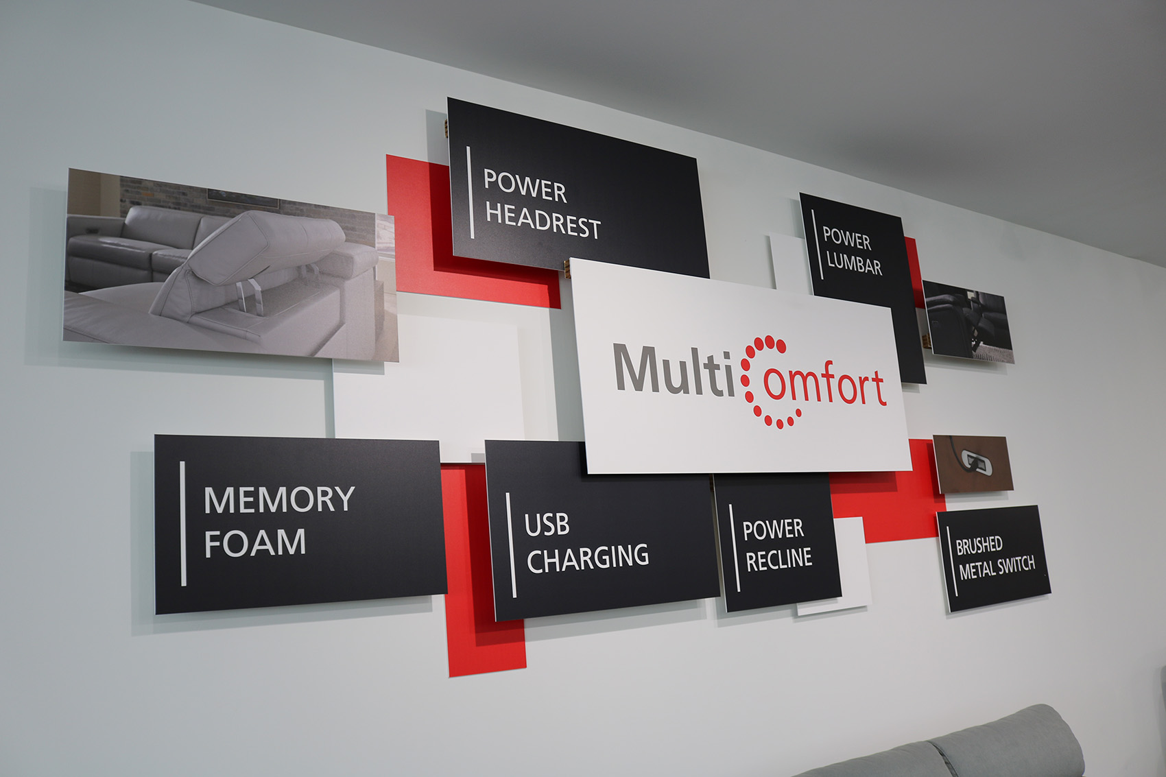
To demonstrate the many features available in our high tech product line, I was able to have some fun with the display techniques, and find interesting ways to list the product characteristics.

The Timeline of Innovation, below, shows the research and development process our team goes through to bring each product to the floor. 

For the chairs area, the interior designer wanted to use podiums to add dimension and interest to each of the product lines. I assisted with hanging banners, which would offer more information about each category of chairs we offered. 

Overally, we received excellent feedback from our sales reps and executives, and I used this show as a springboard to create a new trade show graphics process for future events.


Run 2 Believe Logo

  • Posted By Tia Jasmin
  • on August 8,2017

Run2Believe Charity Logo
BRANDING

Run2Believe is an annual 5K charity run in support of the St Boniface Hospital Foundation. It is the only run in Winnipeg that passes over the iconic St Boniface bridge. 

I was brought on to the Run2Believe project when it was in its infancy. They did not have much more than a name and a vision, so it was my job to visually communicate the Run2Believe concept to a city of runners with an already jam-packed three months (generous for a Winnipeg summer) of running events. 

I wanted to create a logo that people would be able to look at and immediately identify which city run it stood for. I began to play with motion and movement around a simplified skyline. I wanted something abstract enough to be unique, but instantly recognizable by anyone familiar with the city. Ultimately, the team moved in the direction of a full skyline with a feminine runner. I chose colours that would be cohesive with the Foundation’s logo, so there would be an immediate connection between the two.


123
Price: —

Product categories